I've finished reading the
I went and hung out with Manny and his Mrs for a few hours before they had to go. Manny’s getting his drawing on and working out the kinks at the moment (he said he's still a bit rusty). I’ve challenged him to draw a coat of arms for himself and I’m gonna see what I can do about creating one for myself. I’ve also got a shirt design I’m s’posed to be working on for Bear’s band and my mate Grishmael wants me to illustrate a comic he’s written. He doesn’t think I like the joke very much, but I’m just too lazy to draw at the moment. It’ll all happen at some point I’m sure.
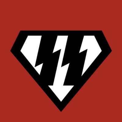
I was messing around with a few ideas today. Grishmael and I were discussing the whole Superman Nazi connection. The Nazi’s were obsessed with a master race of superior humans. Superman looked like a human (even if he’s an alien) and he was superior. The Nazi’s liked blonde hair and blue eyes. I guess superman has black hair not blonde, and I’m really only assuming his eyes are blue but he has Aryan features right? Anyway nevermind that, I ended up making some Superman/Nazi logos. I'm not entirely happy with them but it's not like I'll ever use them for anything anyway. Remember kids, before you email me - I hate Nazi’s too. I quite like this one but the connection to the superman logo is pretty flimsy. I've basically taken out the swastika and put a Ü in the circle. Still I think it looks alright.
 The problem with putting the Ü in the diamond is that it doesn't really fill it. I did this once with normal dots as well but it didn't look that crash hot.
 I like this last one but I'm not sure about the squared off bottoms to the lightning bolts, I actually like them like this but I reckon I'm probably in the minority. I tried extending the lightning bolt to the bottom and that looks dumb because it fills in the bottom of the diamond and I also tried moving them around but this is pretty much the best position for them.
5 comments:
WHat is the point of this blog.
Blogs need to have a point now? Shit somebody better call the blog-police because I'm blogging without a purpose.
We all know how much I hate hard work.
You should check out "Lullaby" by Chuck Palahniuk. Definitely one of my favourite books.
-Brian
Thanks Brian I'll check it out.
Post a Comment